30% increase in numbers of patients using the new platform
Clinic Booking Platform
Project Summary:
We anticipate a significant increase in patients choosing this conceptual platform, potentially 2x the current numbers. Since 85% of users favor online medical appointment booking.
The problem wasn’t just one
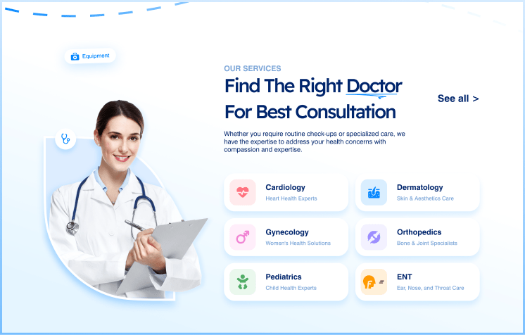
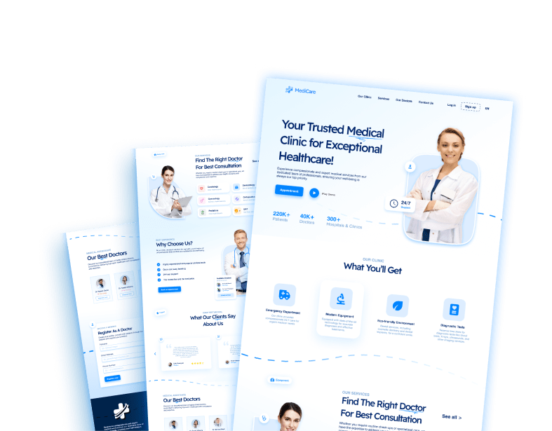
Initially, the challenge was clear: create a platform that makes appointment booking process easier. However, this journey took an unexpected twist. As the project progressed, and from analyzing user behavior I discovered that users weren’t just concerned with booking appointments; they also wanted to explore available services. and adding a dedicated services section to MediCare was the way-to-go.
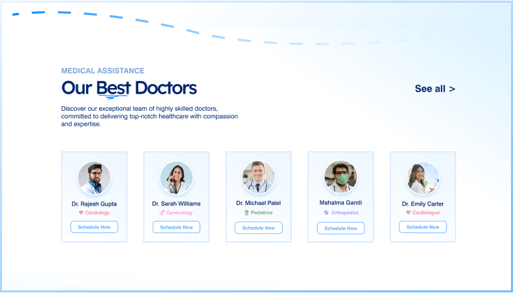
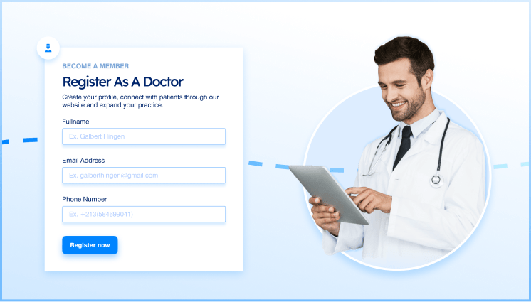
Patients are top-priority
MediCare’s primary users form two distinct groups – patients seeking medical appointments and doctors interested in offering their services. Our goal was to provide a seamless experience for both, ensuring that the platform catered to their unique needs.
My role: do it all
As the sole UX designer and researcher on this project, I had the responsibility of taking the idea from concept to reality. This involved all aspects of design, from initial sketches to the final user interface.
The mandate : 25% increase in booking - in just 2-weeks
MediCare’s journey began as a side project, which naturally imposed certain limitations. Time and resources were constrained. Despite these challenges, the project scope expanded to accommodate the growing demand for a service exploration feature alongside the core appointment booking functionality.
Designing a better solution
MediCare emerged as a solution to simplify the tedious process of booking appointments with healthcare professionals. with the aim of making the healthcare experience more user-friendly for both patients and doctors.
The Working Process and Actions Taken
1. Research & Competitors
Like any similar project, competitive analysis is a must. By studying similar platforms and analyzing their strengths and weaknesses, I gained valuable insights into what works best and what just doesn’t.
2. Problem Reframing
Initially, the challenge was clear However, this journey took an unexpected twist. As the project progressed, and from analyzing user behavior I discovered that users weren’t just concerned with booking appointments; they also wanted to explore available services. and adding a dedicated services section to MediCare was the way-to-go.
3. Design Considerations
MendiCare’s design was driven by a user-centric approach and trust-building elements:
Color matters
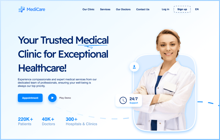
The choice of a calm blue color scheme was rooted in its association with healthcare and tranquility.
Reducing conversion time
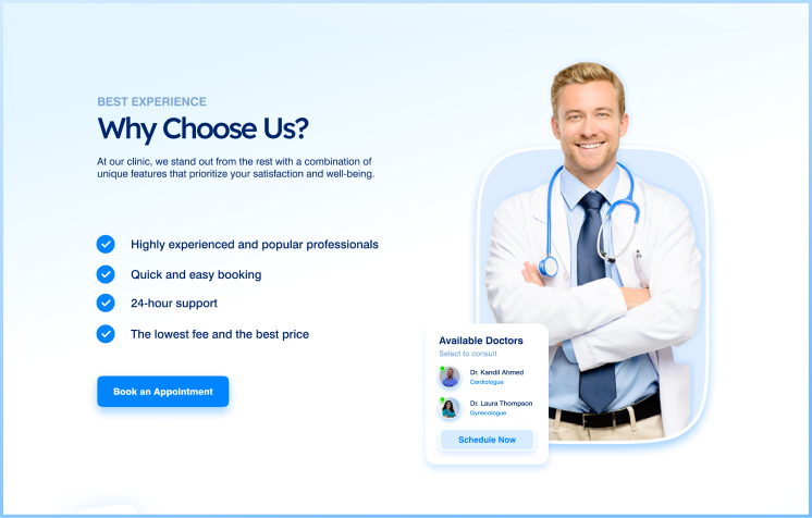
Placing CTA buttons strategically within various sections so that users don’t need to scroll and waste time looking for CTA button.
People trust People
-The decision to use human figures was supported by research indicating that users tend to relate better and trust more when they see human faces.
4. Testing and Iteration
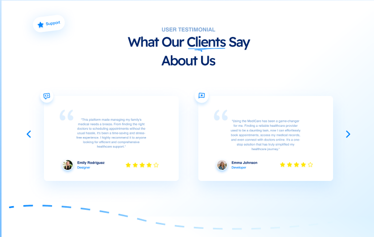
Without direct access to users, I turned to doctors and colleagues for feedback. Their input was invaluable in shaping the platform. Based on their feedback, I introduced a testimonial section to build trust and credibility.
Outcomes and Takeaways:
1. The inclusion of a testimonial section significantly boosted user engagement and trust in the platform.
2. Reordering platform sections to create a more logical flow resulted in an improved user experience.
3. This project underscored the importance of user testing and feedback, even in circumstances where direct user engagement was limited.